Head of Creative and Web
Sr. Director of Marketing
Demand Generation Manager
Front-End Engineer
Sr. UX Designer
No. 1
Overview
Gated content is a key source of information about OmniSci. How might we help people find relevant resources, and in turn bring more leads into our marketing funnel? I led the redesign to improve our Resource Center and increase conversions.
Project Members
My Role
As the UX designer, I led the redesign and incorporated feedback and direction from the marketing stakeholders.
“
How can a niche B2B startup drive more users to download marketing materials?”
No. 2
Problem Definition
The Need
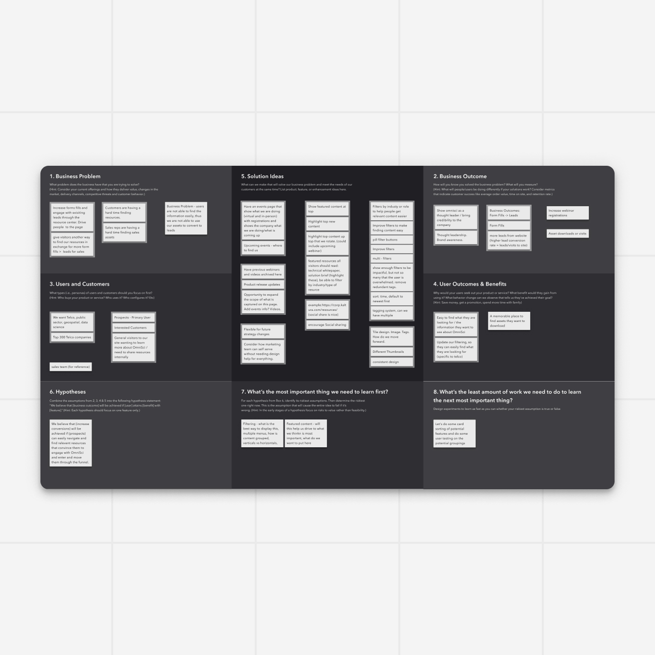
I facilitated a cross functional workshop to help the group define and align on the project. Using the Lean UX Canvas as a guide I built out a template and set of “sticky notes'' in Figma.
The Activity
This was the team's first remote workshop after leaving the office. It served as a great introduction to Figma for the cross-functional team and set them up to review and comment on future Figma mock-ups.
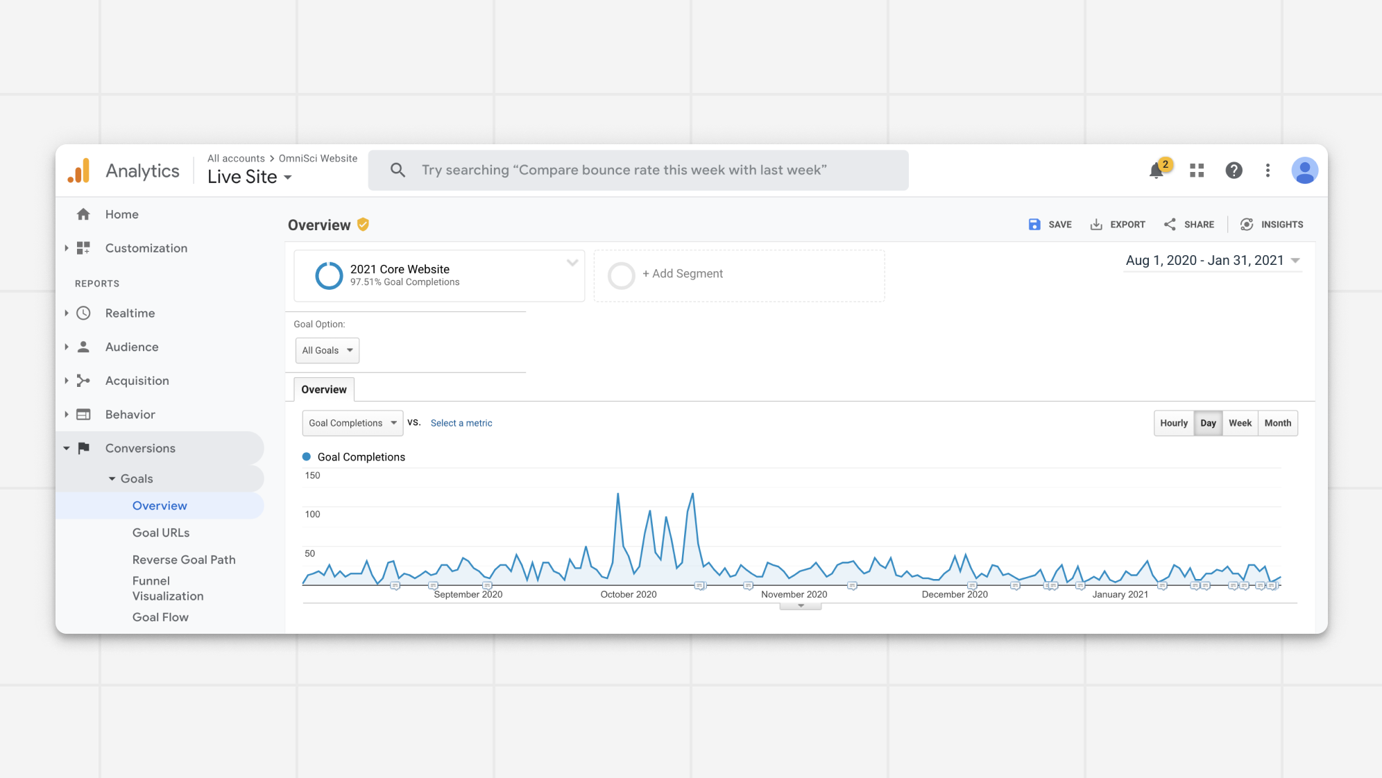
As a data focused business we value and leverage quantitative data whenever possible. I used Google Analytics to research users who had downloaded resources from OmniSci.
As a data focused business we value and leverage quantitative data whenever possible. I used Google Analytics to research users who had downloaded resources from OmniSci.
1
year of data analyzed
3
user personas identified
4
key KPI's selected to measure success
No. 3
Ideation
The Need
How might we display the many resources OmniSci has? How can we pressure test our solutions before we build out the design?
The Activity
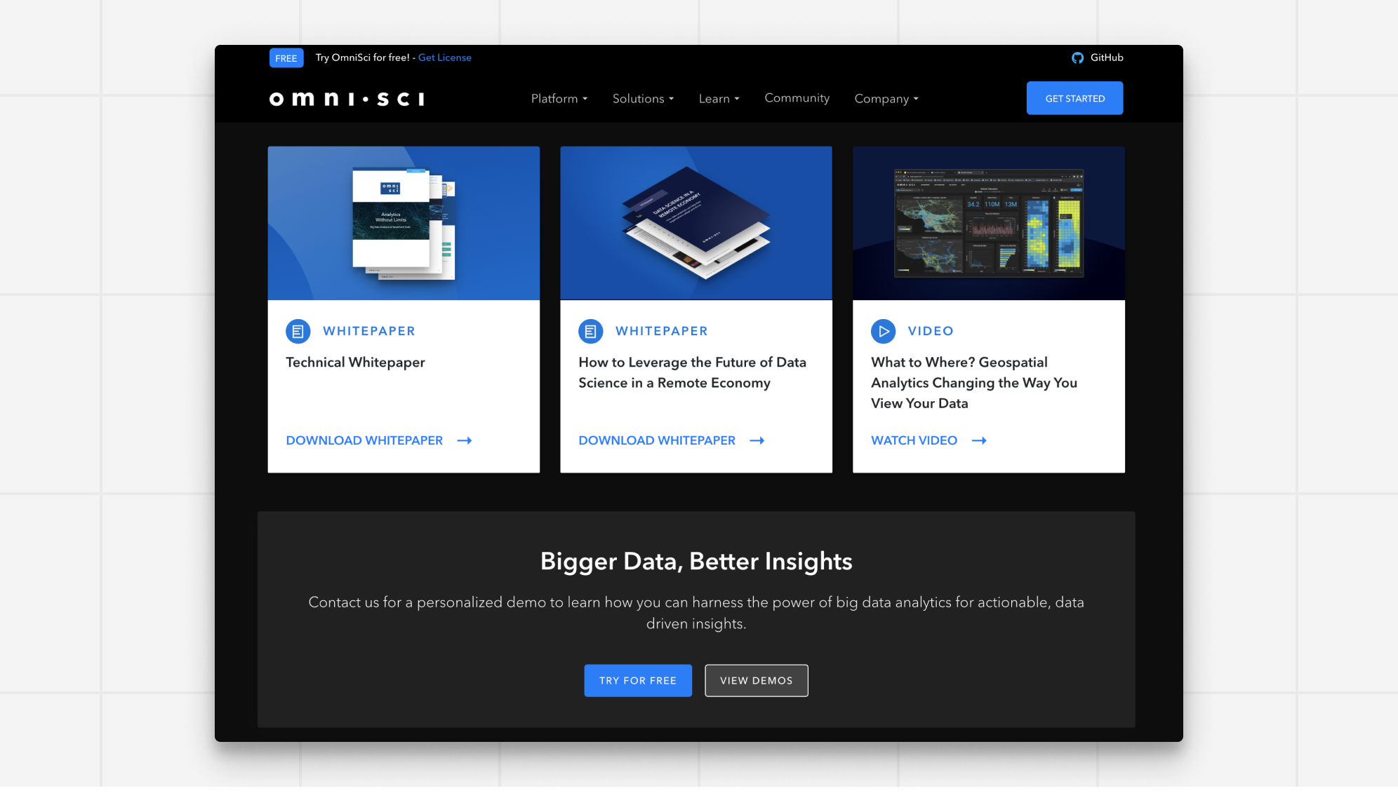
I iterated deeply on the card design to bring it into high fidelity. This card was added to our design system and served as the foundation for new patterns like a carousel.
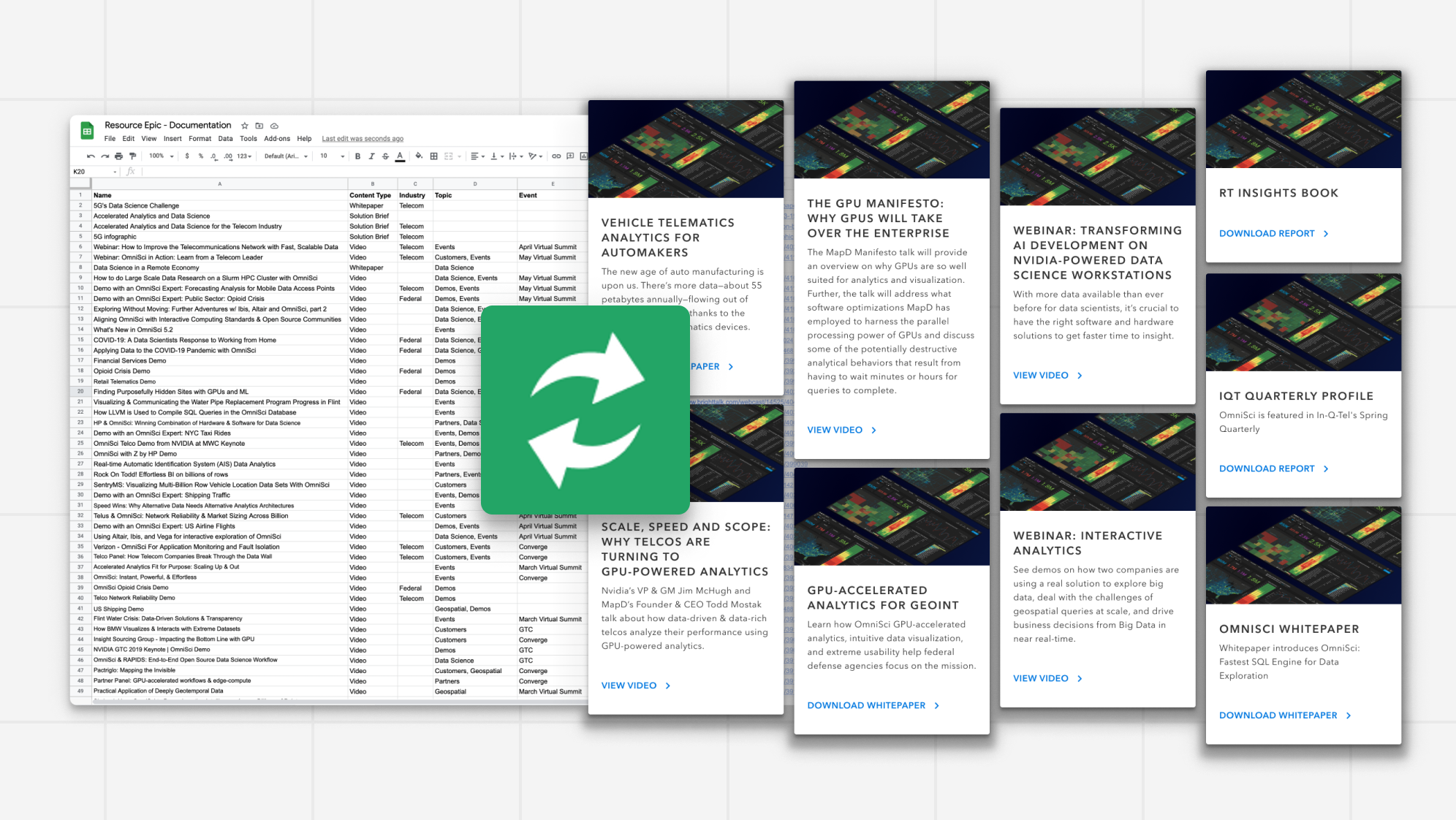
Using the google sheets sync plugin I was able to pressure test our existing cms collection on the design concepts. This helped identify the best solution and inconsistencies in the content.
Using the google sheets sync plugin I was able to pressure test our existing cms collection on the design concepts. This helped identify the best solution and inconsistencies in the content.
∞
iterations on card design
∞
iterations on page layout
500+
pieces of content pressure tested
No. 4
Visual Design
The Need
We wanted to create an experience that as the number of resources grew still looked cohesive, unique, and helped guide users.
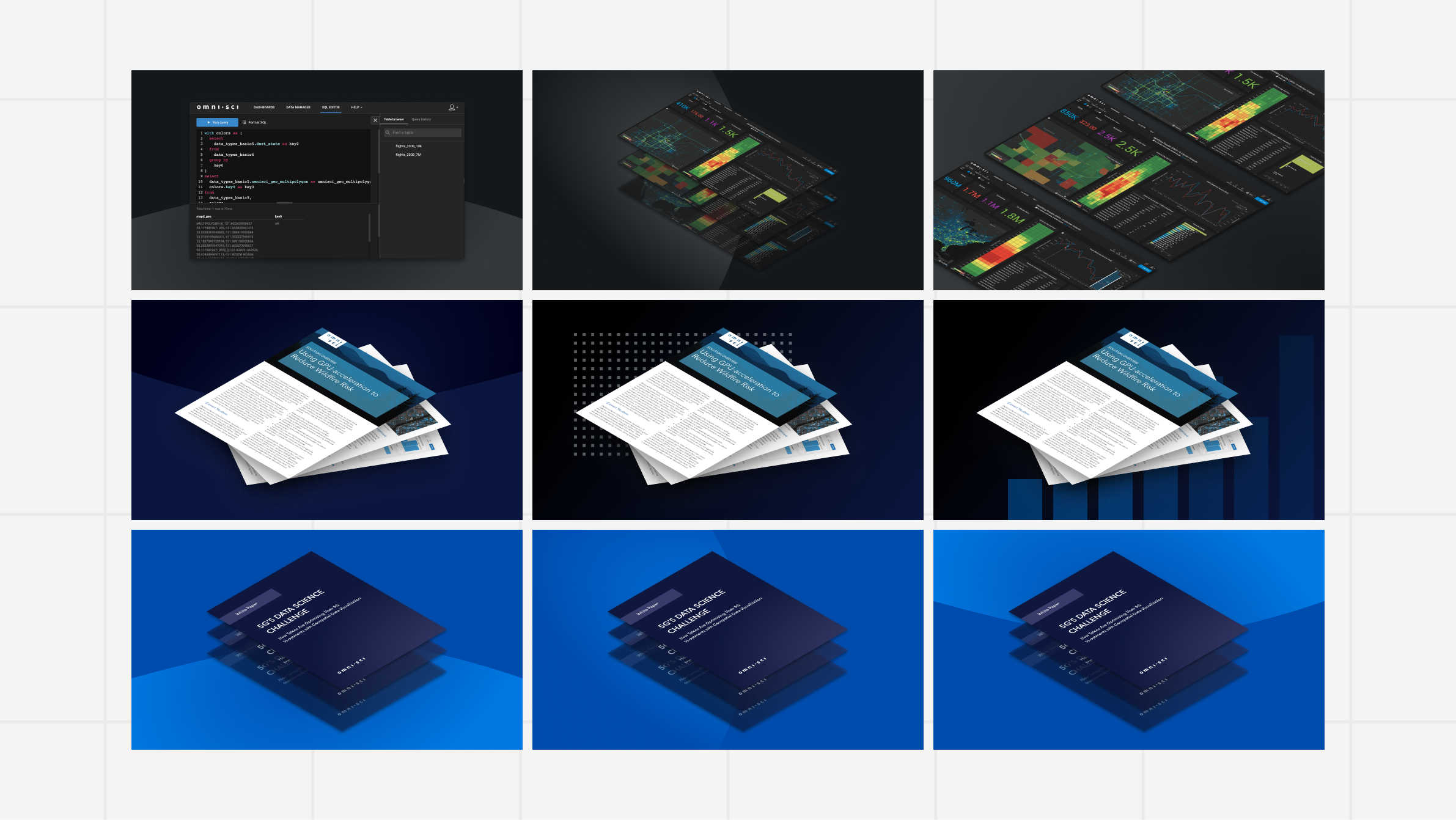
The Activity
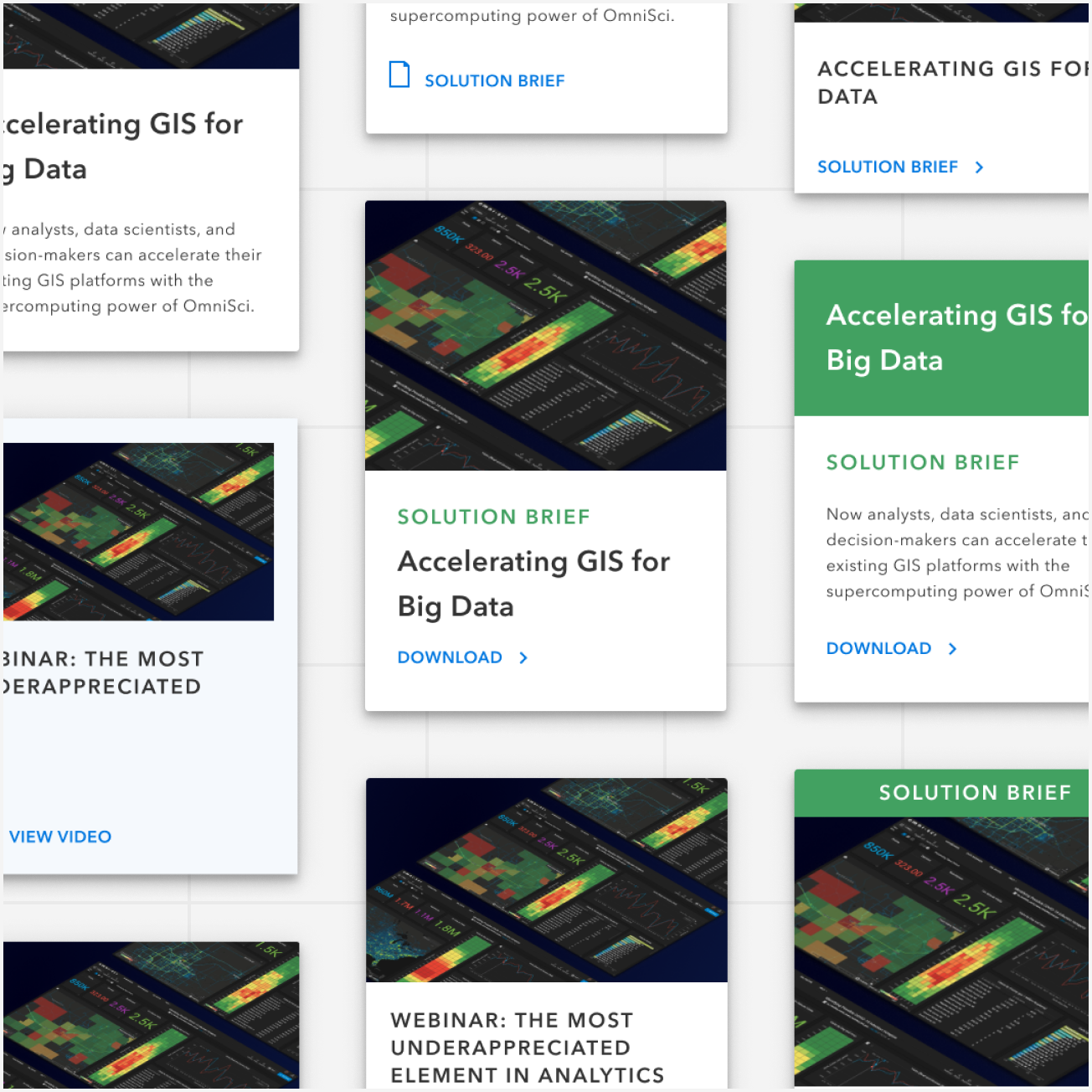
I built out a set of custom icons and an illustration system for resource images. The system included 9 background designs, 4 color options, and 9 composition variations. This results in 324 unique combinations that will sustain this system for its lifetime and reduce workload of production designers.
1
illustration and icon system
8
custom icons with variations
324
image design combinations
No. 5
Outcomes
The Need
How can we leverage this new library across the web to maximize it's impact.
The Activity
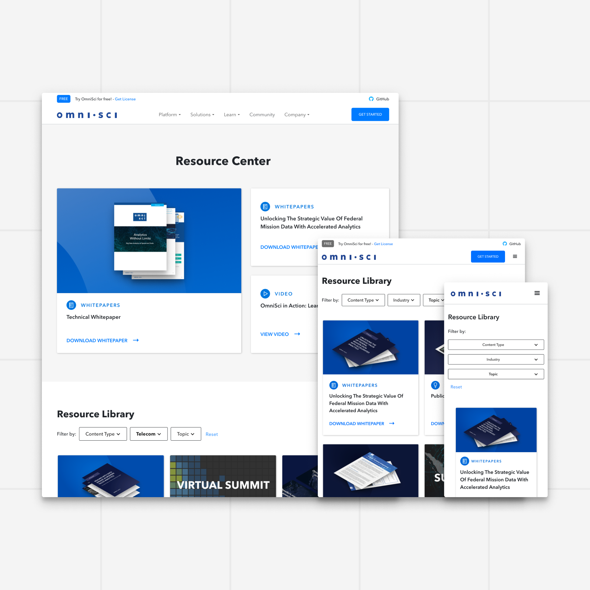
I added CTA’s across the site to link to the resource center and leverage the card design and collection on individual pages. We also used the cms collection to pre-filter assets on our industry and platform pages. This helped surface relevant resources to visitors.
13%
reduction in bounce rate
30%
increase in downloads
2x
visitors reaching the resource page